

|

We Were Never Much for Conversation
|
|

|
|

|
|
|
|
Threads, Baby!
6.10.2002 by , every Thursday.
Greetings and salutations from me, he who never sleeps. This week’s installment of “Underpants on the Outside” is going to me dedicated to as side of comics that is always in the public eye, but rarely talked about, the super hero costume. I’ll be taking a look at some of the designs that the good guys and bad guys wear, offering praise where it’s been earned, and criticism when I deem it deserving. Now, as a warning before we get any further in this article, the opinions presented henceforth are those of the columnist, and do not represent the opinions of tangmonkey.com, it’s editors, or any other body affiliated with the TM name. That being said, let’s get it on!
Let us begin with the “Break-thru” comic book super hero, Superman.

His costume has stayed fairly constant throughout the years, and has been oft imitated. As well, every attempt to deviate from the original costume design has met with horrible failure.
On an aesthetic note, the choice or red and blue with just a touch of yellow are an excellent use of the three primary colours. The short pants on the outside okay in this case, as it was the first reported case of this design, and gets away with it by way of originality. The one flaw is the cuff on the sleeves. I would roll those suckers up in the summer, and get some gloves for the colder months. I give it 4 Under-roos Out of five.
Next up, the dark knight detective, Batman.

He’s gone through a few costume changes over the years. Some good, others are pretty hideous. I’ll be looking at the standard blue and gray. The ears are great, far superior to wings of fins or mowhawks. The bat logo is neat, and pretty much every artist has made it look good. Even the inclusion of the yellow oval doesn’t detract from the feel of the costume.
He also wears his tights under his skivvies, but that just doesn’t work for a detective. The boots are nice, simple, and in the past twenty or so years have gotten more utilitarian, which I like. The gloves have funky, spikey flares, and the colour choice is nice, sticking to the standard limit of three colours. The points on the end of the cape are especially creative. It gets 4 Under-roos.
Moving right along, next up is the Thing, 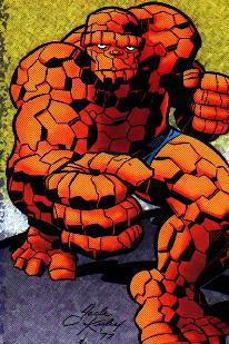 of the Fantastic Four. Blue shorts. Simple, basic, and they make perfect sense. Love this costume. The fact that he weard shorts an not briefs is definately not common in the comic world, and weather he sports a white belt or a black one, it still works. of the Fantastic Four. Blue shorts. Simple, basic, and they make perfect sense. Love this costume. The fact that he weard shorts an not briefs is definately not common in the comic world, and weather he sports a white belt or a black one, it still works.
The choice of blue fits perfectly, brings out his eyes, and contrasts his rocky, orange hide nicely. Occasionally, you can spot the Thing in a beige trenchcoat, but that's not really part of his costume, he's just going incogneto. I give it 4 and � Under-roos, loosing points only because of it’s low-marketability. Maybe he could try a big letter "T" belt buckle to raise his score.
Next up, Marvel Comics’ bowslinger, Hawkeye.

There are some interesting things tried here, like ear holes and that loincloth-thingy that show considerable effort, but a general failure for the design. His cowl is original, but just too cluttered, with the "H" and the pointy mask and the texture. On top of that, having his ears stick out of his cowl makes no sense, as the character is deaf.
The colours work well together, but the two-tone look doesn’t have much “pop”. A character that is given so much witty banter should look less demure and more out there and in your face. I love the character, but his duds only get 2 ‘roos. The terrible travesty of the Hawkeye costume is that they have tried to redo the design, giving him a total overhaul, but this was still the best of his looks.
Dr. Stephen Strange  was a surgeon, until raging alcoholism destroyed his fashion sense. The clashing colours of his outfit are repulsive. The baby blue design on a royal blue shirt, the red cape with yellow fringe and an orange sash and gloves ensemble make me feel ill. was a surgeon, until raging alcoholism destroyed his fashion sense. The clashing colours of his outfit are repulsive. The baby blue design on a royal blue shirt, the red cape with yellow fringe and an orange sash and gloves ensemble make me feel ill.
The tights without shoes look is also not fitting of the “Master of the Mystic Arts”. I like the amulet, even if it is a bit gaudy, it gives him a bit of a “Gangsta Rapper” look, but it’s not enough to lift him over the dismal score of 1 Under-roo. Worse than that, is he changed from his original costume into this monstrosity. You think have arcane magiks at your disposal, you could conjure up some frickin shoes.
The first woman to get mentioned on the list is Jean Grey.  She’s had a ton of codenames and costumes, but we’ll be looking at the time she spent dressed as Phoenix. The green and yellow two-tone usually doesn’t get it done, but since she lets that mess of read hair fly free, it gives it a nice contrast. The sash, while looking terrible on Dr. Strange, it serves to accentuate her hips nicely. She’s had a ton of codenames and costumes, but we’ll be looking at the time she spent dressed as Phoenix. The green and yellow two-tone usually doesn’t get it done, but since she lets that mess of read hair fly free, it gives it a nice contrast. The sash, while looking terrible on Dr. Strange, it serves to accentuate her hips nicely.
I personally liked the look of the green body suit, but it changed to a red one later on, and that just made her look like a blood stain. The green suit gets a respectable 3 ‘roos. It's also important to note that she wore several other costumes that were based on this design, mostly red instead of green, and with the phoenix logo varying in size, and her daughter, Rachel Summers, wore a costume with the stylized firebird as well. As it is with most female heroes, costumes are changed fairly often in order to keep them "in style" for the era in which the books were first published.
The Scarlet Speedster, the Flash, has a decent costume.  He gets points for the good use of colour, the fact that his boots have tread, and the simple, yet easily identifiable chest logo. He loses a few though for the wing things on his head, and for the dumb lightning belt. Also, the white circle could contrast more with the lightning bolt, maybe with a darker outline. He gets points for the good use of colour, the fact that his boots have tread, and the simple, yet easily identifiable chest logo. He loses a few though for the wing things on his head, and for the dumb lightning belt. Also, the white circle could contrast more with the lightning bolt, maybe with a darker outline.
All in all, a solid, if not spectacular costume, earning a 3 Under-roos rating. Solid red is very eye catching, and it makes for good speed blurrs. The cowl is simple enough to show lots of facial expression, and the boots look like boots. As a side note, the original Flash wore a metal pie plate on his head, which for some reason, never became a staple of hero-wear, as apposed to the cape. Why? The world my never understand why capes caught on and pie plates did not.
Wonder Woman, Amazon princess.  What I fail to understand in this costume is why it is so pro American. I can understand the use of the red white and blue look in someone like Captain America, but the white stars are just too much for me to take. Also, the red star on her tiara is incomprehensible. The few saving graces in this costume are the cool-io metal armbands, and the cleverness of her metal chest plate sculpted to form the letters “WW”, for Wonder Woman, get it? 2 Under-roos. What I fail to understand in this costume is why it is so pro American. I can understand the use of the red white and blue look in someone like Captain America, but the white stars are just too much for me to take. Also, the red star on her tiara is incomprehensible. The few saving graces in this costume are the cool-io metal armbands, and the cleverness of her metal chest plate sculpted to form the letters “WW”, for Wonder Woman, get it? 2 Under-roos.
That’s all for this week, but check back soon for more neat stuff, and in the coming weeks, and interview with comic great, Barry Windsor-Smith.
Scott MacIver

| Take a minute to fill out this nice form and give the nice columnist some nice feedback. Our columnists are volunteers, they do this for you, let 'em know you care. |
|
| |
| 
| 
| | 
| 
|
Warning: require(): http:// wrapper is disabled in the server configuration by allow_url_include=0 in /home/public/columns/includes/footer.php on line 3
Warning: require(http://www.tangmonkey.com/includes/ads.php): Failed to open stream: no suitable wrapper could be found in /home/public/columns/includes/footer.php on line 3
Fatal error: Uncaught Error: Failed opening required 'http://www.tangmonkey.com/includes/ads.php' (include_path='.:/usr/local/php/8.1.33-nfsn4/lib/:/usr/local/php/lib/') in /home/public/columns/includes/footer.php:3
Stack trace:
#0 /home/public/columns/102370104026423.php(77): require()
#1 {main}
thrown in /home/public/columns/includes/footer.php on line 3
|